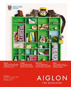
Aiglon Magazine
From the Judges' Report
- A story about the history of the school's sweet shop was beautifully designed and an enjoyable read. The judges enjoyed the story about the global art market (which utilized alumni experts as sources). We also appreciated that the magazine didn't shy away completely from humor. For example, a pull quote in a story about the school's housekeeping staff reads: "We feel very protective of the students, even if that means telling them off-I mean, teaching them how to do things!"And speaking of pullquotes, the judges appreciated the magazine's use of devices such as deks, pullquotes, and photo captions for pulling readers into the story.
- While one judge thought the content skewed a little too "promotional," most of us thought the magazine did an excellent job of capturing the culture and the personality of the school. The magazine also has a clear editorial plan, which also contributed to its success with our judges.
- Aiglon scored very highly for its design. This magazine could hold its own on a newsstand. The design is fresh and innovative and really impressed our judges. They utilize a lot of photography, but it isn't predictable, i.e., there isn't a lot of formal portraiture, which our judges really appreciated. For a story about the school's original guiding principles, the magazine featured photographs of pages from the typewritten rule book, dated September 1964.
- "This not a magazine that would have appeal to someone who is not familiar with the school. It's very exclusive-as if they're saying to their readers: "Remember that you are part of this exclusive club."
- "The magazine is very focused on their community, but that's what they're claiming they do, so they're meeting their mission."