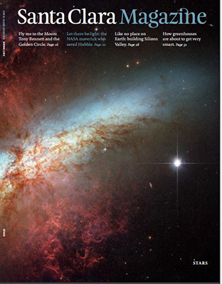
Santa Clara Magazine
Year: 2017
Award Level: Gold
Award Winner(s): Santa Clara University
Award: Circle of Excellence
Category: Magazines | General Interest Magazines
From the Judges' Report
- Santa Clara Magazine pulls together all of these approaches: a smart, deep publication with beautiful design, quality photo selection, and rich printing on uncoated stock. Santa Clara invites readers in with a gorgeous, full-bleed cover photo that wraps to the back cover and dissolves into black. Accompanying the cover image is a short thematic statement--"Stars" on one, accompanied by an arresting image from the Hubble space telescope, and "Come Together" on another, with a close-up, monochromatic photo of the wizened hands of Mother Teresa holding a rosary. Judges' reports frequently criticize even the winners for poor cover choices, but Santa Clara does covers very well.
- The entire magazine is well considered and constructed, holding together without weak points or pieces that feel ill-considered or forced. The magazine is filled, in the words of one judge, with "nice surprises"--simple but effective typographic elements, appropriately used photographs, some shorter pieces that say just enough to convey meaning without overstaying their welcome. Each issue opens with a full-bleed, two-page image and caption setting the stage for what comes later. Although this is not a particularly original feature (several other titles do some form of this), it's done quite well here with photos that are worthy of this placement.
- In a short piece at the beginning of the summer 2016 issue, the editors bragged of the awards Santa Clara has received since its redesign and wrote of their mission to make the magazine "a place of greater breadth and depth, for stories big and small." A year into this new focus, Santa Clara continues to uphold that promise. Shorter hits at the beginning--stories of a few paragraphs, feature photos, infographics--cover a wide range of information and don't overwhelm, and they keep readers moving into the features. The magazine then moves into greater depth as it presents features that are both movingly written and married expertly with art. A journal by an alumna writing about her experiences with the Syrian refugee crisis in Greece is presented with the alumna's own photos, including a two-page opening photo that is at once beautiful (a sunburst over the sea) and heartbreaking (wrecked ships and abandoned life jackets littering the foreground). There's so much to take in.
- Santa Clara Magazine represents its university well and is deserving of highest honors.