The York University Magazine
About the entry
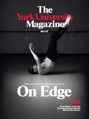
The magazine design shares the elements and motifs of the print companion piece. A bold use of type and strong imagery were defined as a direction that would work well for online reading. In addition, sections and identifiers that would feel familiar to readers of the print version were translated into online elements. Each story was given a "coming up" teaser at its end that would encourage further exploring of content even if the reader was sent from an outside referral (i.e. social media link). A contents screen is accessible by a universal link on each story. This link also allows for moving backwards and forwards from story to story as well as returning to the cover page.
From the Judges' Report
Completely unique design. Interesting that it mimicked a print magazine but was fully digital. Judges felt the site had a high-gloss feel and appreciated the read next feature. They liked the minimalist design but did find the navigation a little difficult to use.