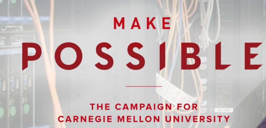
Make Possible Campaign Website
From the Nominator
Produced for Carnegie Mellon University’s $2 billion comprehensive fundraising campaign, the campaign’s website, makepossible.cmu.edu, is the hub for all storytelling and information about the university’s largest fundraising initiative. Using modern website design and a focus on user experience, the site was built around the idea that a campaign is not about dollars raised, but rather the impact those funds will have. It focuses on communicating with alumni, donors, friends, and others about the impact they can have on the university through support of the campaign. The site engages and inspires, using responsive design with ample white space, subtle but dynamic use of animations, clever illustrations, well-chosen photos, and well-crafted content.
From the Judges
Today’s collegiate world is driven by large fundraising campaigns, but the bigger ask is how do we get a story authentic to our identity into the world? That is a question Carnegie Mellon has an answer for. Their Make Possible campaign site stands on telling their story—not their financial goal. The site pulls you deeper and deeper down the page, engaging with each area you see. Animations guide you through the story and help make the site feel personal to you. With more than 10,200 page views and an average session duration of nearly six minutes, you can tell the audience felt the same. We just wanted to keep clicking on more content. By the end, we were ready to give! Our hope is their audience feels the same, but Carnegie Mellon can stand tall on the fact that their story is being heard.