Stanford Medicine Magazine
From the Nominator
Stanford Medicine magazine is designed to attract busy readers inside and outside of academic medicine who are interested in medical research, discoveries, and developments at Stanford. While the magazine tackles topics normally found in medical journals and professional publications, we aim to create a magazine as compelling as the best consumer magazines. An accessible yet exciting design is key to accomplishing that goal. Each issue of the magazine features a themed package in addition to regular departments and other non-themed material. The fall 2019 issue, for example, introduces readers to the new Stanford Hospital, which is designed not only to accommodate changing health care technology and practice over the next century, but also to encourage healing through its use of light and open architecture. In addition to the themed package, every issue includes short articles on recent Stanford research developments; inside looks at innovative research or programs; in-depth articles on other topics; book excerpts; and Q&As with prominent people from the art, literature, and political worlds, as well as leaders of health policy and biomedical research. The magazine is published four times a year and averages 42 pages. Its print circulation is about 29,000; subscribers include Stanford medical school alumni, biomedical thought leaders, members of the media, donors, the Stanford Medicine community, and the general public.
From the Judges
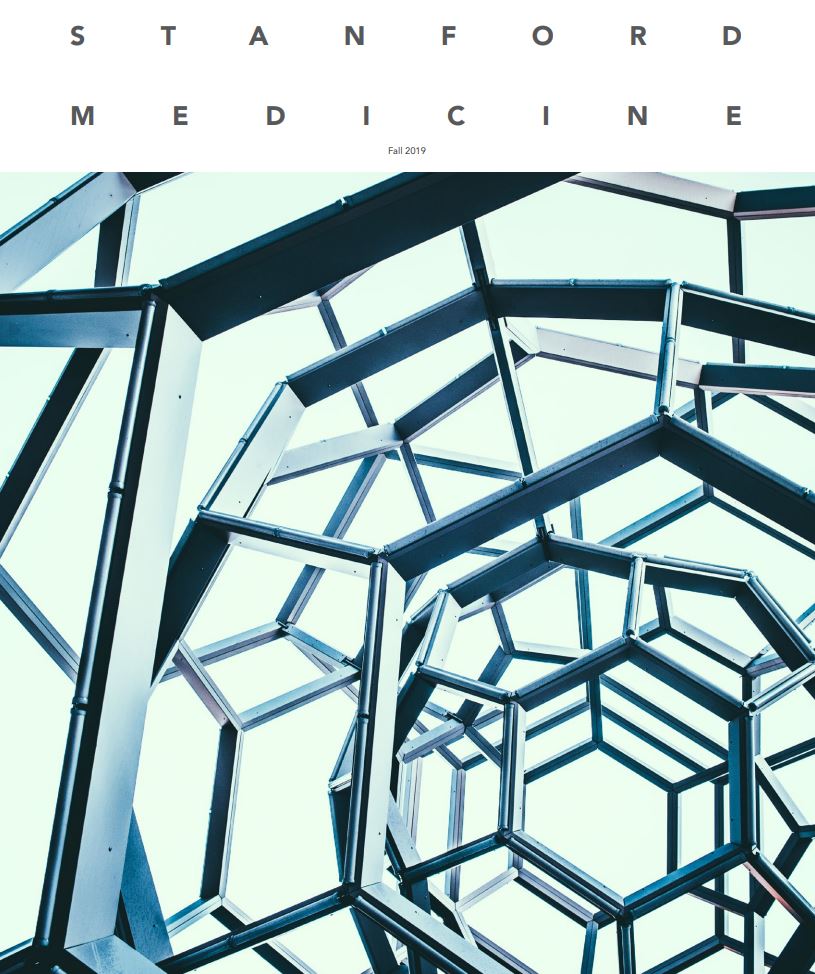
From the striking sculptural detail image and title font arrangement on the front cover to the generally pleasing layout of the interior, there is an almost architectural sense of space about this design. It fits well with the theme of the issue: showcasing the opening of a new building. The three-column approach in the features section is generally very stylish and pleasing to the eye, and gives a nice sense of progress to the more intricate internal pieces of the magazine. There was a successful play with an architectural vibe for the magazine, in keeping with the aesthetic of the medical centre. More broadly, the magazine has set as a target taking a more themed and in-depth approach to its content for an educated general readership, as well increasing interest for its subscriber base. The emphasis placed on commissioned illustrations and photography add something to the more human feel the team was going for, with entertaining photographic images and pleasing illustrations used well throughout. It stays away (as far as possible) from a more institutional vibe, while also showcasing a medical building. Overall this is a pleasing and almost restful magazine to browse, very in keeping with its stated aims and readership.