Data Storytelling in Action
When Charlie Melichar and his colleagues at Colgate University sized up a data-heavy alumni magazine feature, they knew they had to try a different storytelling approach.
It was 2009, and their task was to capture the viral success of a celebrated lecture by Albert A. Bartlett, a graduate of the Hamilton, New York, U.S., university. Bartlett, a physicist and professor emeritus at the University of Colorado Boulder, dedicated his life to the study of exponential growth, with a focus on energy resources. His simple but explosive hypothesis was that there were too many people on Earth to sustain life in the long term. But presenting his complex mathematical concepts in a print magazine wasn’t a straightforward task.
The resulting feature in the autumn 2009 issue, “Growing Pains,” starts in a conventional way: with a headline and standfirst (or quick summary), a small headshot of Bartlett, and columns of text. Colorful cartoon illustrations of people by artist Linda Davick sprout at the bottom of the spread. Turn the page, though, and the story transforms. The people have rapidly multiplied and stand together in towers, competing with the text. By the final spread, the illustration has taken over, leaving space only for a spirited call-to-action about understanding the consequences of exponential population growth.

GROWING PAINS: This Colgate University magazine feature used illustrations to crowd the page and visually depict the impact of exponential population growth.
Melichar, who was at the time Colgate's Vice President of Public Relations and Communications, and his team wanted the visuals to carry the message and the maths. Their experiment paid off.
“People were thrilled, because you expect that could have been a very dry piece, right? It could have been interesting and factual, but it also could be something that could feel dense,” says Melichar, who’s now Principal at the consultancy Foster Avenue. “And there’s a playfulness too. I think giving your writer, your designer, and your team the space to play a bit, even if it’s for a really high-level, academic, challenging piece, can be an underused tool in our kit.”
Melichar’s experience illustrates a key challenge in advancement: combining data and storytelling in meaningful ways. Let the following key concepts of data-driven storytelling be your guide—and see how other teams have applied them to reach their donors, alumni, and other key stakeholders.
Using Head and Heart
Good data-driven storytelling involves finding the right balance between sharing statistics and the human stories underpinning the figures.
Melichar—who has held senior communications and advancement roles at Colgate; the University of Maryland, Baltimore County, U.S.; and Vanderbilt University in Nashville, Tennessee, U.S.—shares another instructive example of this. During his time at Colgate, the university’s campaign for financial aid aimed to address the gap between what students’ degrees cost and what their families could afford—not merely quantifying that deficit but humanizing it.
“We decided to tell the story through the students who should have had the opportunity and would have made the place better. And we didn't use real names, but we created profiles from applications of students who didn't get admitted,” he says. “And it was heart-wrenching because these were incredibly talented kids. ‘X more dollars equals X more aid,’ doesn't have a face. But to say: ‘This is Jim Johnson and wouldn’t he have made this place better?’ was very impactful.”
The facts and figures mattered—but the message paired with them was: “How are we letting ourselves miss this opportunity?,” Melichar says.
That’s why fluency when discussing data can be useful, particularly in the field of fundraising—but you need to engage both the “head and heart” in your storytelling.
“I think it’s a skill and a muscle that folks have to build to know what that right balance is,” he says.
Starting With a Story
Like Melichar, I got my start in visual communication by editing an alumni magazine (at the University of Queensland in Brisbane, Australia).
That early experience of working closely with talented designers, photographers, and videographers shaped my understanding of how to present and package a story in creative and compelling ways.
As my career progressed, I focused on the mechanics of best practice storytelling and have presented on the topic at conferences around the world, including for CASE. In 2019, I decided to create training workshops on data-driven storytelling for advancement and engagement professionals who were keen to experiment with this dynamic content format, but lacked a background in statistics.
I struggled to know where to start, though. At first, I tried to develop a typology of different chart and graph options that would be useful for beginning practitioners. But how should I decide which ones to include, and which to leave out?
A 2014 article by Thomas H. Davenport in the Harvard Business Review made me realize I had placed the proverbial cart before the horse. Davenport, a professor of Information Technology and Management at Babson College in Massachusetts, U.S., writes about how pairing narratives and analytics together in storytelling is valuable. But knowing that data storytelling matters isn’t enough.
“What’s needed is a framework for understanding the different kinds of stories that data and analytics can tell. If you don’t know what kind of story you want to tell, you probably won’t tell a good one,” he states plainly.

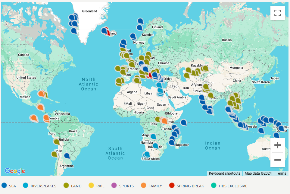
MAPPING OPPORTUNITIES: Place can be a powerful element in data storytelling. This map from Harvard University shows upcoming tours and learning experiences.
Empowered with this realization, I sought to determine the most common types of stories that organizations tell about themselves. The eight essential plots of data-driven storytelling that I’ve discovered are:
- Time. Time-based visualizations are incredibly versatile and can be highly illustrative. Timelines can be scaled or unscaled, depending on the subject matter and context. For example: an illustrated timeline in a commemorative publication that captures the history of your institution.
- Relationships. Think laterally about the people, places, objects, outputs, entities, ideas, and events that are connected to your work, and how they can be effectively visualized. For example: this award-winning microsite that Northeastern University (Boston, Massachusetts, U.S.) created to showcase the deep connections between its faculty, alumni, and donors.
- Place. A map can make a valuable addition to any corporate document or website. It can also be a powerful internal engagement tool to identify gaps in service delivery or output. For example: this interactive map depicting upcoming tours for the Harvard Alumni Travels (Boston, Massachusetts, U.S.) program.
- Process. Empower your audience to better understand the processes that will unlock their goals. For example: this simple, visualized chart that the University of Bergen (Norway) created to explain the complicated path to a doctoral degree.
- Comparison. Making direct comparisons between activities, services, and outcomes can be a compelling messaging strategy. For example: a table explaining the different levels and benefits of a giving society.
- What’s in it? If you can visualize the composition of something, you can better communicate its value and appeal. For example: an engaging architectural rendering with captions that brings to life the vision behind your capital campaign.
- Parts of a whole. We can visualize the composition of services or other intangible items by exploring relative cost, percentage, or other measurements. For example: a series of donut charts showing the different activities and programs that the annual fund supports.
- Brand story. Use data to tell meaningful and compelling stories about what you do, how you do it, and why. For example: at-a-glance facts and figures used at the start of an annual report or strategic plan.
First, make a broad decision about which plotline to focus on. Then, the narrower choice of which visual format to use will come into view.
Becoming a Sommelier of Stories
Matching the right storyline with the right visualization format is much like pairing food and wine: it gets easier with practice. Once you are confident about the story you intend to tell, you can zero in on the right chart, graph, or infographic for the job. (To simplify this task, I decided to create DataDeck—a color-coded series of prompt cards to kick-start the visualization process).

CAREER PATHWAYS: This Smith College visualization depicts graduates' program of study on the left and career field on the right.
When Smith College—a liberal arts college in Northampton, Massachusetts, U.S.—wanted to share the surprising, diverse paths of its graduates, its alumni team reached for a Sankey diagram. Sankeys are wonderful for visualising flows—showing the state of one thing that becomes another—which is why they are often employed in the oil and gas industry. In this instance, the flow being represented is the relationship between a respondent’s broad undergraduate discipline and their eventual specialized field of employment.
To create this visualization, Smith’s team polled graduates who were two, five, 10, 15, or 20 years post-graduation.
Sankeys are a popular choice among data scientists, but they rarely feature in admissions campaigns. In this case, the visual representation of thousands of graduates and their vocational pathways intrigued potential students and alumni alike. When the survey findings were first posted to the Smith Facebook page, the comments lit up with affirming stories from alumnae keen to share how studying at the institution had helped them to land their dream career.
When the right story and visualization format combine, it can feel like magic. But you need to be absolutely sure that your interpretation of the data is correct.
In 1983, Edward Tufte published The Visual Display of Quantitative Information. This seminal text has been revised across multiple editions and remains in print, such is its influence on the field of data visualization. Tufte offers blunt advice on many topics, including the common problem of conflating correlation with causation.
“An ill-specified or preposterous model or a puny data set cannot be rescued by a graphic (or by calculation), no matter how clever or fancy. A silly theory means a silly graphic,” Tufte writes.
Dataviz or Infographic?
These terms are often used interchangeably but should not be confused with one another. Data visualization (often shortened to dataviz) represents data “as is”. When scientists present the findings of an experiment in a peer-reviewed journal article, they are using dataviz. The Smith College Sankey diagram also fits this definition.

UNIFORM GUIDELINES: This infographic created by Scots College in Wellington, New Zealand, shows parents how students' uniforms should be worn.
When an organization wants to tell a story or explain a concept in a highly visual fashion, they might craft an informative graphic, such as this uniform guidelines illustration produced by Scots College in Wellington, New Zealand. Telling parents and students how the uniform guidelines should be applied is one thing; showing them is another. A text explainer would confuse some readers, but a visual depiction is unequivocal.
Consider “pure” dataviz such as the Smith College Sankey diagram at one end of a continuum and the Scots College infographic at the other. I use the term “data-driven storytelling” because it embraces all of the possibilities along this continuum. (Many infographics do, in fact, incorporate pieces of dataviz, alongside brand elements, photography, and text.)
I refer to these hybrid visualizations as “stacked” infographics, as they contain multiple visual and data-driven entry points to unpack the issue or story at hand. The University of Richmond (Virginia, U.S.) did this effectively in its award-winning “Spider Census” feature. It combines photography, facts and figures, pictograms, and graphs to share compelling demographic insights into the university’s alumni community.

SPIDER CENSUS: This University of Richmond feature, which won a gold Circle of Excellence Award for data storytelling in 2020, uses data, charts, and photos to show the breadth of the university's community.
Another example is this engaging 2014 infographic from Coventry University (U.K.). It offers multiple data points and messages to promote its research achievements in a national benchmarking exercise known as the Research Excellence Framework. Together, each of these figures tells the story of Coventry’s REF results.
A Creative Way to Encourage Teamwork
One of the great things about data-driven storytelling is that it’s best handled by a team, as the Colgate alumni magazine case study attests. Ideally, you’ll have colleagues from data science, communications, and design working together, pooling their perspectives to find the best solution.
“I’d say the main thing is don't be afraid to ask for help,” Melichar advises. “Bring in a strong designer, bring in a strong data analyst, and think together about how you can tell that story, because everyone's going to bring something different to it.
“And it's also a nice way to get out of silos, where if you use your full resources in the organization to tell the story, everyone's going to benefit from that.”
Then and Now: Data-Driven Storytelling to the Rescue

STOPPING DISEASE: By mapping cholera deaths in 1850s London, doctor John Snow was able to trace the source of the epidemic to this contaminated pump. Removing the handle saved lives.
Choosing the right chart, graph, or infographic to match your message can do more than boost your next story or campaign. It might just save the world.
On your next trip to London, England, visit the unassuming water pump at Broadwick Street in Soho. In 1854, this area was crawling with cholera, a deadly new disease without a cure. At the time, it was widely considered that such maladies were airborne, but physician John Snow had a different idea. He speculated that cholera was spread by water, and his pioneering visualization proved that contaminated water from the public water pump at Broad Street (as it was then known), was the source of many deaths in the neighbouring population. He petitioned to have the pump’s handle removed and brought the London cholera epidemic to an end.
Fast forward to 2020 and the world was gripped with a deadly new disease—COVID-19. This time, it was not a map that changed people’s minds, but a simple model displaying two contrasting epidemic curves or scenarios. Back in 2007, the Centers for Disease Control and Prevention had published this figure below, known as a density plot, in a report anticipating future pandemics. The aim was to show what would happen if too many people became ill at once and overwhelmed our public health systems. Density plots focus on distribution over a particular range or time period, and feature an easy-to-understand wave shape.
This unassuming figure hid in the CDC report until February 2020, when The Economist adapted the graphic for a feature titled “Flattening the curve”. The saying entered the global vernacular and became a rallying call-to-action, saving an untold number of lives.

UNDERSTANDING OUTBREAKS: The Centers for Disease Control created this graphic for guidance on influenza back in 2007. The image re-emerged in 2020 as a tool to understand the spread of COVID-19.
About the author(s)
Cameron Pegg is a content and storytelling strategist based in Brisbane, Australia. He has written for Currents, presented at CASE conferences, and judged the Circle of Excellence Awards category for online writing. Cameron is the creator of DataDeck, a hands-on tool to help storytellers and teams quickly and effectively devise data visualization and infographic concepts.
Tags
Article appears in:

November - December 2024
DIGITAL-ONLY ISSUE - Using data, visualizations, and infographics to reach donors and alumni.
Plus communications strategies for corporate relations professionals, the story behind one university's new alumni center, a look inside CASE's new Latin America benchmarking project, and more.


