AIGLON
About the entry
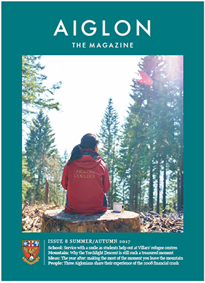
AIGLON magazine is the key component of Aiglon's communications strategy, reinforcing the life long journey of education for an adventurous life. Through a mix of short color slots and longer features it strengthens and illuminates what it means to be Aiglon: what is like to be at Aiglon, to embody it and to live the Aiglon ethos—the balanced development of mind, body and spirit.
From the Judges' Report
The Aiglon College has an extremely professional quality in its photography and print. It has an editorial type feel with its beautiful balance of white space, large images and integration of copy. As one judge is noted, “It reads like National Geographic magazine.” They creatively used lines and white boxes to separate copy from images; clean san serif font used throughout and pops of color are only deployed for important areas like headlines and pull-quotes. Great use of bounding boxes to integrate illustrations within copy. It’s both modern and classic. Every article contained interesting material relevant to their school and their surroundings. At first, some of the judges were a little thrown off by the advertisements feeling like it took away from the articles. However, even the style of the ads complimented the magazine look, feel, and style. Aiglon College really knows their audience and delivers the kind of magazine you would expect; a modern and classic design beautifully presented. This is a coffee table piece.