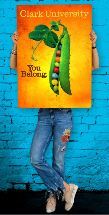
Clark University Admissions Package: "You Belong"
From the Nominator
This year, Clark University reimagined our admissions materials for a new generation of prospective students by resurrecting an iconic image from our past: the Clark pea pod. Filled with multicolored peas, the pea pod illustrates our messaging that Clark is a welcoming community of varied individuals and that our differences are our institution’s strength.
From the Judges
When your entire judging group marvels at the exquisiteness of an entry, you know you have a winner on your hands. That was how we felt when looking at Clark University’s admissions package. From the pieces, we understood what Clark University was about, what type of place it was. The theme “You Belong” resonated on every page: judges even felt like we belonged!
Reviving the iconic image of the pea pod was delightful; the color treatment was especially fresh and fun. The pieces were visually stunning—the color, typography, infographics, and photography all pulled you in. They were energetic, age-appropriate, and engaging. Diversity was evident in both copy and photography. Each piece, though different, held together under a comprehensive brand identity. The student voice comes through with multiple quotes.