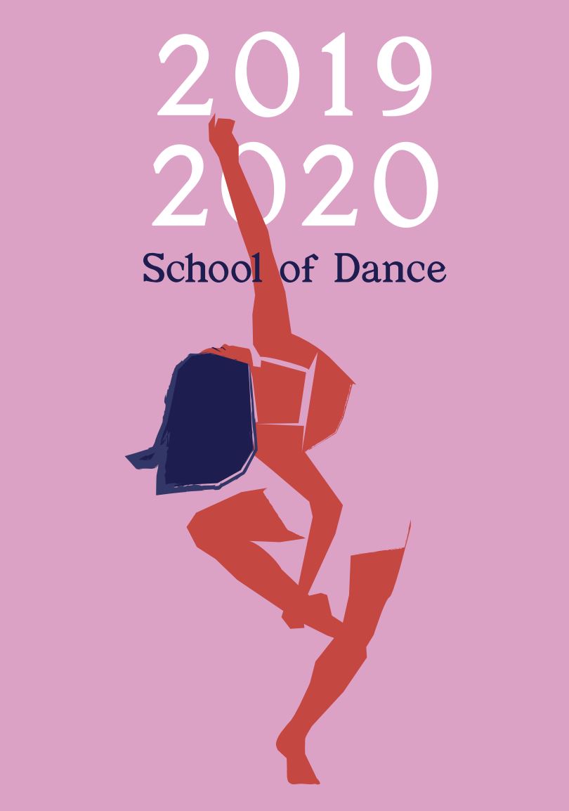
School of Dance Season Posters
From the Nominator
Inspired by the diversity of styles and disciplines within the school of dance, the 2019/2020 season branding was designed to engage both the rich dance community on campus as well as wider audiences in Salt Lake City. Pairing graphical, simplistic forms with a fresh modern pallet, the illustrations used throughout the campaign allow for a flexibility that can encompass the season’s range of dance from ballet to modern.
From the Judges
The judges unanimously agreed that these illustrated posters were fresh, exciting, and unexpected in their direction. The creative use of negative space and handmade art reminded the judges of Matisse's cutout art. This lets the art be minimal, yet still convey a lush energy and fluid vibe. The artwork is restrained and minimal but conveys energy and respect for the art form of dance. The color palette was unique and unexpected. The typography was carefully handled with a keen eye to balance the hierarchy while harmonizing with the art.


