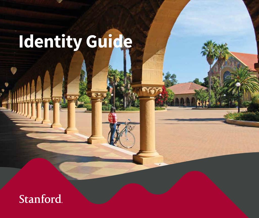
Identity Guide
From the Nominator
The purpose of the identity guide is to inspire, align, and make more impactful all Stanford visual and verbal communications. It is a creative resource to support a strong, cohesive Stanford identity across the university.
This is Stanford’s first comprehensive university-wide brand guide in 130 years. It is available as a print or PDF version, and a more in-depth website. The guide was built upon a 2012 branding system with the aim of creating a more robust, more current resource. The project was led by University Communications in close collaboration with communicators and leaders across Stanford, and with the higher education firm Ologie.
New components in the guide include a brand statement, personality traits, an icon set, an updated color palette with a greater focus on digital use, an automated logo generator, and downloadable visual elements.
Since 2012, higher education communications has changed significantly as universities increasingly recognize the importance of protecting and deploying their brands in complex environments. Higher ed branding is often associated with recruitment marketing, however it also intersects with marketing in areas involving research sponsorship, philanthropy, technology licensing, and public and private collaboration. Demand was high for a new brand guide, given our current digital environment, which calls for stronger visual brand cohesion and creativity across a wide variety of platforms. In addition, a larger community of dispersed communicators are increasingly seeking centralized resources and guidance within Stanford.
From the Judges
This brand guide is very well laid out and very informative. We appreciated that they broke down what things like kerning are for the people reading the guide who may not be up on the lingo. We also liked the suggested color schemes, as well as the suggested compositions for how much of each color should be in each piece.


