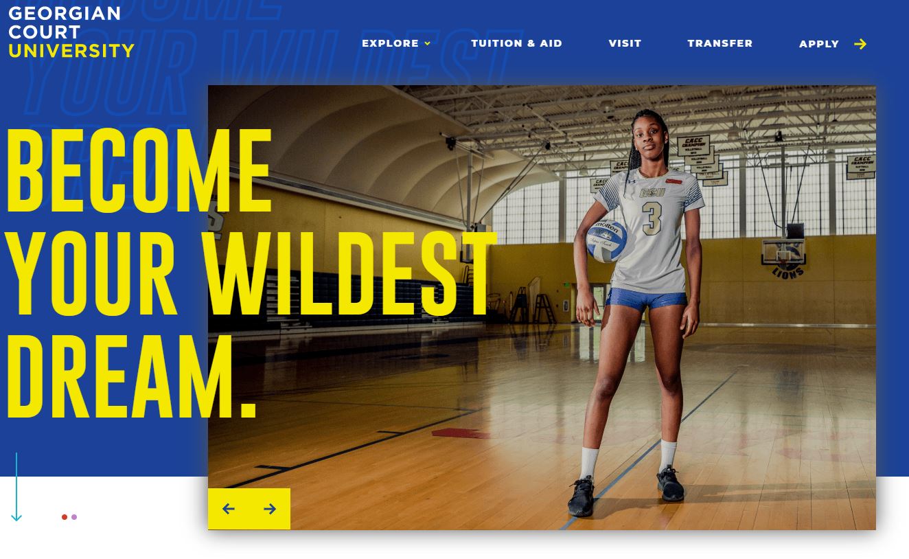
Undergraduate Admissions Microsite "Become Your Wildest Dream"
From the Nominator
Our strategy for https://expand.georgian.edu is to create a comprehensive undergraduate admissions microsite as a digital destination for advertising, and the primary URL for GCU’s viewbook and other admissions materials. Prospects can access all the information needed to apply in one location in a highly visual and digestible manner—strong preferences for Gen Z.
Our clear, streamlined navigation follows the primary phases of decision making, moving undergrads to EXPLORE (quick hits on GCU outcomes, affordability, academics, student life) to TUITION AND AID, to booking a VISIT, and ultimately to APPLY. The site features an instantly engaging, bold, high-energy visual identity that is atypical/unique for faith-based schools. A vibrant color palette, graphical patterns and bold typography anchor our visual approach, along with authentic, energetic lifestyle photography of GCU students.
Understanding that Gen Z is mobile centric, we designed and built mobile first to ensure scalability and design integrity across all devices. User experience centers on highly scannable pages featuring concise copy, icons and infographics to highlight key messaging, creating “thumb-stopping” moments. Subtle, dynamic animation augments user experience without being distracting. https://expand.georgian.edu co-exists in the same hosting environment as the main university website for ease of management and maintenance, and full accessibility by admissions staff. The microsite was developed as part of a suite of admissions materials, allowing efficiencies in visual and written content. Early metrics indicate visitors find the content compelling, with 15% pursuing our primary call to action to apply. Admits are also up from the prior year.
From the Judges
Georgian Court demonstrated a strong understanding of its target audience, thoughtfully assessing their Gen Z demographic and what the university's and website's value proposition would be to them. This mobile-first site is vibrant, relatable, and streamlined, and the strong site copy and layout maximizes impact for the user. The visual design is clean, kinetic, and a fantastic extension of the institutional site branding. The effort greatly expanded the reach of this small university, with early metrics showing visits from 1,000 cities and 15% of visitors engaging with the call to action to apply.