Case for Support - For Alaska Campaign
From the Nominator
"In 2021, the University of Alaska announced the launch of its first system-wide fundraising campaign, "For Alaska." A few attributes defined our donors: bold, blue-collar, and active in advancing Alaska.
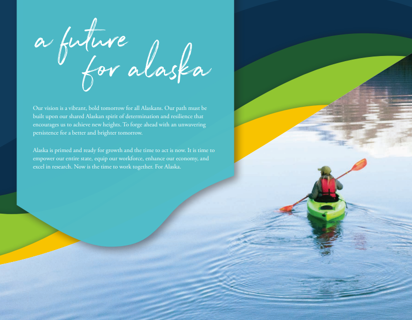
We developed the campaign identity and publications around these ideas. A rugged script throughout the materials reinforces the idea that Alaska is being built by hand, while the vibrant colors represent the evolving and emerging future of the region. The wave mark exemplifies constant motion, a continued movement forward. It can both shape and yet be shaped by its surroundings, the very essence of the UA system, and its place in the region. The campaign case statement reflects these ideas. We developed traditional ideas in nontraditional, modern ways: bold, vibrant colors; adding waveforms to traditional text boxes; a landscape folder instead of a traditional portrait layout.
The folder itself is clear and straight to the point, announcing the campaign and explaining its purpose. For those who may not have participated in one before—this being the first system-wide campaign—we wanted to be clear, not complicated. We created three sets of supporting inserts—one for each university—to dive deeper into the impact each makes in the four campaign priorities: education, research, workforce, and the economy. For example, research by (UA) Fairbanks is different than (UA) Anchorage’s. (UA) Southeast affects the workforce and economy in its region in different ways than the other universities. This strategy ties all three universities together under one campaign umbrella, but also allows each to tell their own unique stories."
From the Judges
The vibrancy of the piece really drew us in, and the thoughtfulness of creating pieces that would work across the colors of their various campuses was done very well.


