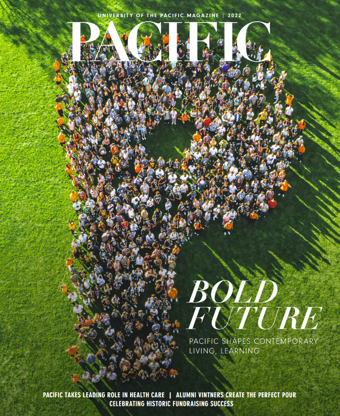
Pacific Magazine
From the Nominator
"Pacific Magazine, formerly known as Pacific Review, has been through many evolutions in its almost 100 years of publication. In 2019, the university went through a rebrand that focused on impactful storytelling with strategic delivery. The new direction called for a reimagining and expansion of its annual magazine from 36 to 132 pages.
Before the rebranding, the publication focused primarily on engaging with alumni; stories felt small and internal, and the art direction lacked distinction and personality. The goal was to tackle these issues with strategy and outcomes in mind. The magazine's reach grew by 9,200 in the past two years by including storytelling that aligns with enrollment goals, donor cultivation, and other revenue-generating programs. The increase of pages allowed for in-depth features and showcased the impact of Pacific with measurable calls to action. To support the new brand, the creative identity continues to be consistent, bold, and engaging.
In addition, new processes were created and implemented to stay on course. From producing an eight-month production schedule with individual team milestones to designing a roadmap for writers and designers to guide them through their initial concept to print, the strategic work behind the scenes produced efficiencies, productivity, and a book delivered on time.
Pacific Magazine continues to have overwhelming support. The Pacific community has been generous with their praise, including President Christopher Callahan, who said, 'I've been in higher education for more than 30 years. This is one of the best magazines of its kind I've ever seen.'"
From the Judges
The judges appreciated the publication for its high readability, ensuring that the content was easily accessible and engaging for readers. The consistent color thread maintained throughout the publication created a visually cohesive and pleasing experience. The judges particularly noted the successful relationship between the front and back covers, which effectively complemented each other and contributed to a well-rounded visual presentation.


