An Exciting, New Chapter for the Oregon Stater Alumni Magazine
From the Nominator
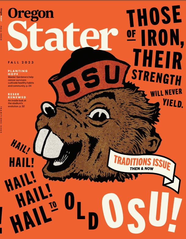
For more than 100 years, the Oregon Stater has been Oregon State University’s flagship publication for storytelling. With this redesign, we wanted to give the magazine a contemporary look that reflected our cutting-edge research university. Part of the Oregon State brand is enthusiastic engagement with science and engineering—we’re not afraid to geek out a bit—and we leaned into that exuberant love of learning as a guidepost for the redesign. The reveal of the “new” Oregon Stater coincided with the launch of our $1.75 billion Believe It fundraising and engagement campaign. The magazine provided an exclamation point on the year by celebrating the accomplishments of OSU’s people and bringing to life its research and history.
From the Judges
Oregon State University transformed a run-of-the-mill school magazine to a standout from cover to cover. It made us want to pick it up and read all of it. Their new magazine was the result of a thoughtful process that tapped an advisory board and reader and alumni feedback. We particularly liked their covers, like a whimsical orange one that included their mascot and one of a surfacing shark that highlights their professors’ research on the often-maligned animal. In addition, Oregon State’s newly designed magazine makes good use of photography and illustration to draw readers in, incorporating white space, infographics, and photo packages that balanced out the longer stories and features.


