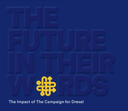
"The Future in Their Words" Campaign-Close Publication
From the Nominator
The Future in Their Words serves as a vibrant stewardship publication that celebrates the diverse experiences of Drexel students, alumni, and community beneficiaries. The publication spotlights the transformative impact of the university’s recent fundraising triumph “The Future Is a Place We Make: The Campaign for Drexel.” Concluding on June 30, 2022, this campaign exceeded its $750 million target, amassing $806 million and mobilizing an unprecedented 46,000+ alumni and friends. This 118-page highly visual narrative, underscored by compelling photography, was strategically disseminated: An 8- x 11.75-inch print edition reached approximately 2,500 VIP donors, enhanced by a personalized note from the university’s president. A digital version extended its reach to all individuals and organizations that engaged with Drexel during the campaign, garnering 2,779 views and an average read time of 2.5 minutes. Organized around core fundraising themes—Fueling Student Success, Advancing Pioneering Teaching, Accelerating High-Impact Research, Partnering with Communities, Building a Better Drexel, and Igniting Our Dragon Spirit—the publication featured impactful headlines, concise narratives, and poignant quotes, alongside important data and milestones. Although tangible results for a stewardship piece like this are challenging to quantify, the publication’s reception—evidenced by a 44% email open rate of the digital version and by positive feedback on the print version from internal stakeholders, peers, and donors—suggests a significant, positive impact on Drexel’s community and its commitment to excellence.
From the Judges
This was a nicely executed example of a photobook-style piece that felt fresher than the norm. Some thoughtful touches made it stand out. The flipbook edge was creative, and animation elements were unexpected; the texture of the chosen materials also made the finished product feel more elevated. The use of photography was strong; the fonts and sizing of the limited text was a good fit for the audience. The designer had some fun with the photo layouts, not a predictable grid, but still fresh and professional. We particularly liked the cover and the breakout of sections by color, which helps the viewer navigate the piece.


