Kenyon Visit Materials
From the Nominator
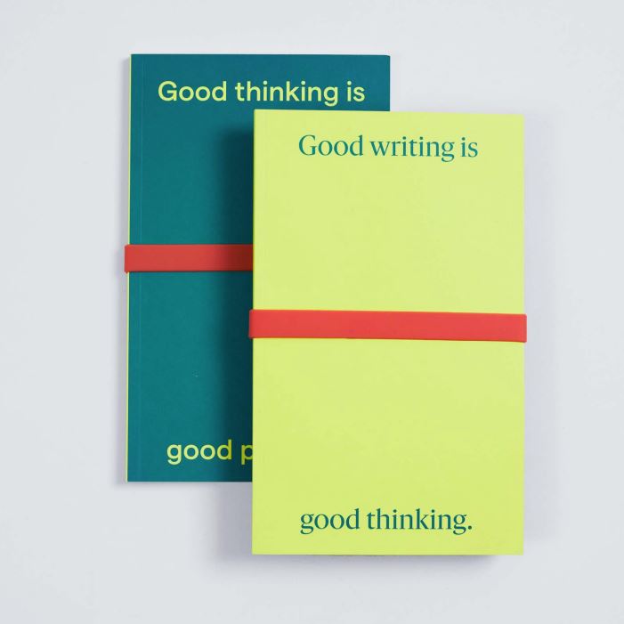
We designed a package of materials for prospective students to receive when visiting campus. When the Office of Admissions moved into a newly constructed building, we set out to produce pieces to add color and interest to the modern space. Because the admissions process can be stressful, we chose to create playful materials that would spark joy and curiosity among prospective students. The journal, map, and puzzle were all created as takeaways for visitors, with a focus on interactivity—from the ways they can be folded, flipped, and scribbled on. They also were designed to appeal to a variety of thinkers, giving users different ways to engage with each piece. As a nod to Kenyon’s reputation as a writer’s college, the journal cover reads, “Good writing is good thinking.” To broaden the definition of what makes a good writer, the back cover reads, “Good thinking is good practice.” The pages display a mix of lines, dots, and grids for recipients to use as they’d like. Designed to be tucked into the band around the journal, one side of the map features photos of must-visit campus stops, while the other shows a traditional map. The heart of the puzzle is a Kenyon crossword created by a Kenyon graduate, though visual learners can choose to connect dots. The pieces have been successful conversation starters in admissions, and many visitors have said the journal as the most memorable publication they’ve received from a college.
From the Judges
A unique concept that speaks directly to the type of student Kenyon College is looking to recruit. Additionally, we enjoyed the creativity with the crossword puzzle.