MIT Brand System Refresh and Expansion
From the Nominator
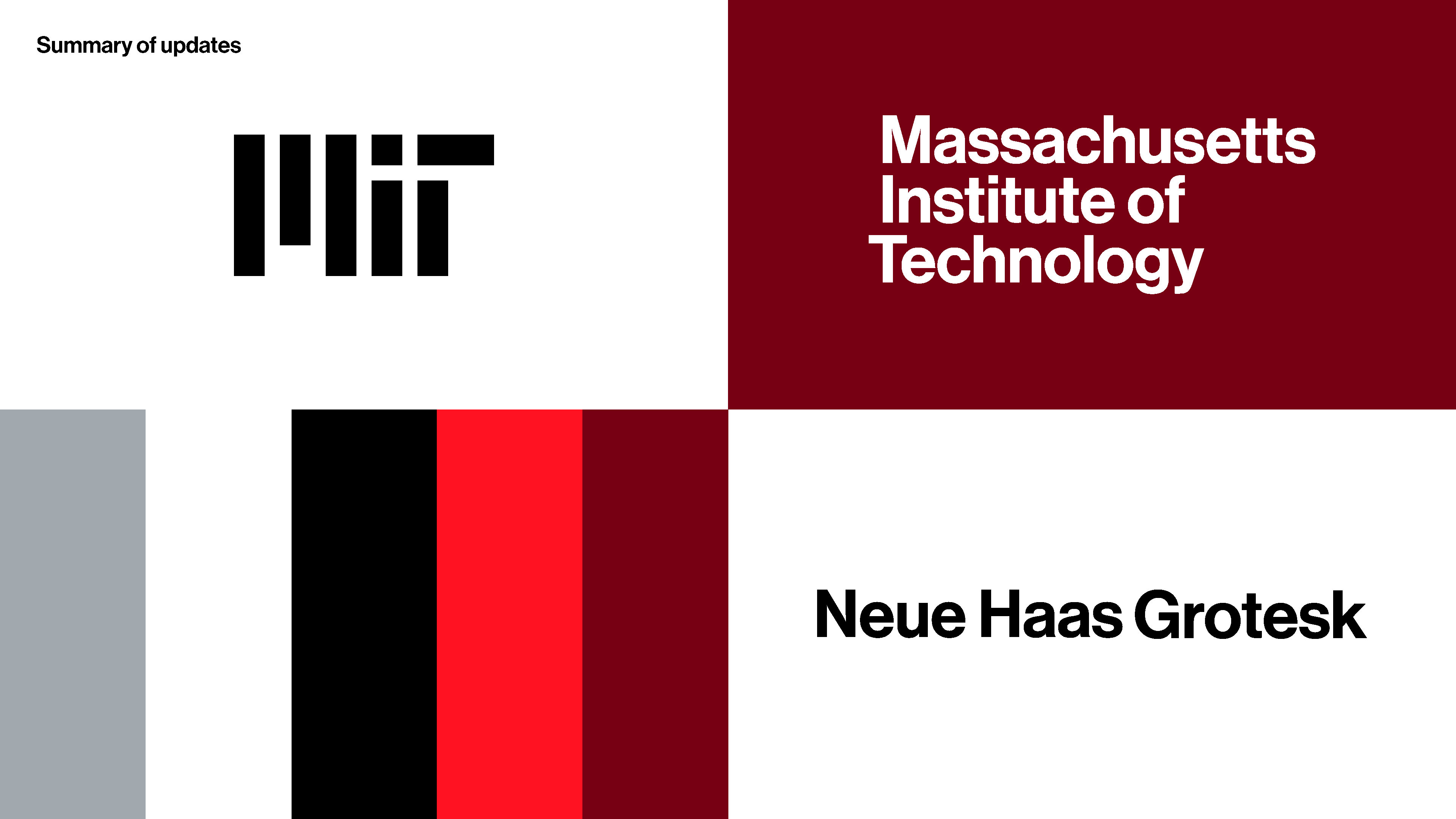
The Massachusetts Institute of Technology's former brand system consisted of just the MIT logo, seal, and a few legacy colors. We wanted to move toward a broader system that would result in better consistency, allow for creative expression, spark inspiration, and encourage adoption. Also, our logo was created in 2003, and it needed a refresh to work better across all applications. Our two main audiences are the internal MIT community and creative vendors who produce work for MIT. After working with a branding firm to update the system, we partnered with a design firm to bring the brand to life through a new website and a production designer to build department logos. The updates include the following: a modernized MIT logo that’s been simplified to one color; an expanded color palette; a set of suggested typefaces; updated options for how departments may express themselves relative to the MIT parent brand; updated MIT seal and Tim the Beaver illustrations; templates for letterhead and presentation decks; and new designs for printed stationery and business cards. We announced the updates in September 2023, and there has been widespread adoption. We’ve seen the system’s elements being used on all types of communications – from websites featuring the expanded color palette to presentations using the new PowerPoint template to department merchandise with the new sub-brand logo lockup. We’ve also received positive feedback on how much people like using the system because of its flexibility. Our work is ongoing as we continue to educate the community about the brand system and its benefits.
From the Judges
Great approach to a new identity system with phased buy-in and managed upgrades for units.


