Where Discovery Meets Democracy
From the Nominator
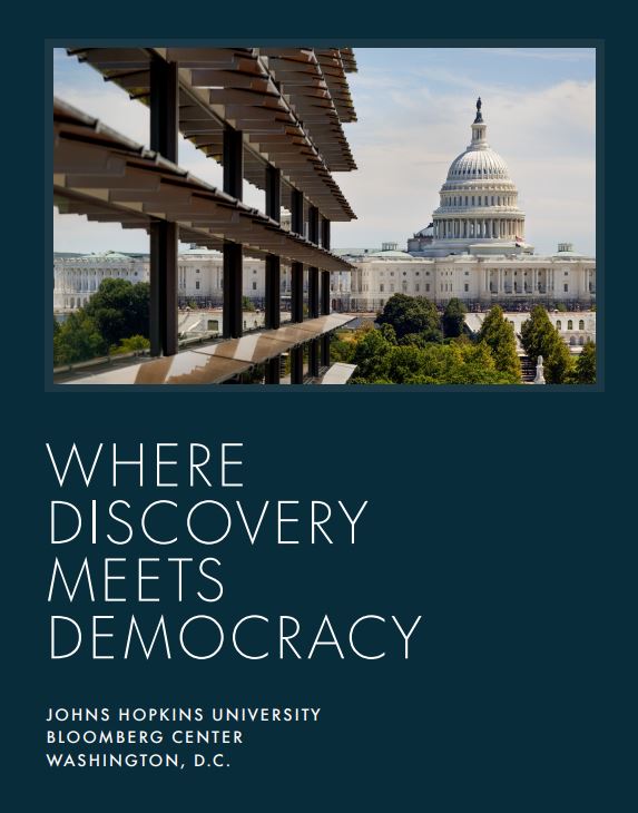
Where Discovery Meets Democracy--a 136-page hardback, linen-covered coffee table-style book--was created to mark an important milestone in the history of Johns Hopkins University (JHU). For the first time, all the university’s programs in Washington, D.C., have come together under one roof in a new location, the Johns Hopkins Bloomberg Center on Pennsylvania Avenue. The book weaves together two stories—that of Johns Hopkins, America’s first research university, and its contributions to the public good and that of Pennsylvania Avenue, America’s civic stage. The title and cover design reflect the mission of the Hopkins Bloomberg Center—to deepen the university’s commitment to delivering evidence-based research to fuel discovery, democracy, and global dialogue, as well as acknowledging the significance of the location's proximity to Capitol Hill. The book also celebrates the building, formerly the Newseum, which has been reimagined as a dynamic, interactive space, filled with light and inspiring public art. From the outset, the design of the book was informed by our desire to appeal to two audiences. First, the Hopkins family—donors, trustees, alumni, and those who will call the new building home—but also politicians, philanthropists, corporate leaders, and thought leaders with no affiliation to Johns Hopkins, but who we hope will support the Center’s mission and its programming. Over 1,000 books have been distributed, and we are receiving positive feedback from all quarters.
From the Judges
This is a lovely publication featuring stunning photography with levels of detail that felt like abstract art. The constraint of typography and use of white space felt luxurious. Very clean, yet bold in design. The historic shots of the building blended seamlessly with the contemporary shots--a challenge of bringing the past and present together that is often difficult to achieve but is executed with sophistication and elegance in this stunning example. The timeline was also nicely laid out. This was an expensive and large-scale piece. One criticism was that the text font size was difficult to read and would have been better sized up a notch (minimum 11-point font is suggested for readability). Overall, a strong pride piece--especially about a building--that is iconic and archival in nature and sure to be a treasured keepsake.


